Saturday, March 17, 2012

DC Prelim #2

I finished the record.  It was created first in Ai with the Elliptical tool.  This gave me a very basic black disc shape that I would use as the base of the record.

I added hundreds of 1 pt stroke ellipses to add the grooves in various purple, grey and black shades.  I also used the perspective circle grid at the very end to give it some structure.

I added lighting effects in Ps, placed the map of Africa on the album and started to decide on my text.  I have gone back an forth about this a lot and tried maybe 5 techniques so far.  I thought I wanted to do something with smoke text but decided to just add some smoke with a smoke brush and do a freeform Neon text.  I am very happy with the rough draft and I think it will be perfect after I add the value it needs to look like a glass neon tube.

Monday, March 12, 2012

DC Prelim-Record

I started to recreate the record.  I have not had a lot of luck adding lighting effects.  I want to give it some more value and like the way it was done in the sample I used but can't get the same effect.  I am still undecided on what text I will add.

Sunday, March 11, 2012

Design Competition Prelim #1

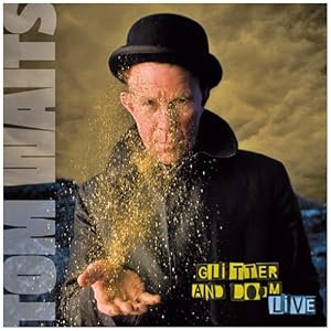
Original Glitter and Doom Cover
I chose the  http://www.reggaepostercontest.com/.  I have had a lot of trouble settling on an idea for this assignment.  This is the 3rd project I have started.  The record image in the background is not mine I would have to recreate that and i am not entirely sure I can do that with any success.  For the text I tried a few different ideas and I'm not in love with either.  the "neon" text distorts badly and I am unsure why.  The wind text I like but have to try and tone it down a bit.  I did recreate the map of Africa from a photo I took of the globe in my office using the pen tool in Ai so I guess that's at least something I can work off of, though I have to say I am feeling very blocked and plan on seeing what everyone else is up to and maybe having another look at my options.  Although I am getting tired of starting over at this point.


Saturday, February 25, 2012

Final Glitter and Doom Cover

This is the final image.  My husband is a huge Tom Waits fan and he took some great shots at his Glitter and Doom show in Dublin so I knew immediately this would be my starting point.

I cropped the image so I could add some text around the outside and began layering on the different text elements.

The Doom letters at the bottom I created by watching the tutorial that I posted in our discussion,  The flame texture was created by http://shaedsofgrey.deviantart.com/art/fire-45734782.
I used several different layer blend modes and added some clouds to enhance the smoke.

Tom Waits, Glitter & Doom

Original Glitter and Doom Cover


This what I have so far.  I have to make doom vertical and place it in the other image.

Friday, February 17, 2012

Portrait recreation

Original Glitter and Doom Cover
Image I took of my husband which I placed into Ai.
This is the vector image I created in Ai.
After pulling the vector into Ps, I used the brush tool (mostly 1-5 point lines) to add color and texture back into the image.
This is the "final" image.  Given more time I would have gone back to my original rough sketch and added more shadow to the forehead but overall I was happy with the stylized illustration that I created and I think with some refinement I could use it as an animation.  I use a mouse for all of my drawing which I find very cumbersome and I wonder if I should look for a drawing tablet instead.


Burning Newspapers

This is a photo I took of a stack of newspapers.  I pulled it into Photoshop and added this flame technique that I learned on Youtube. http://youtu.be/qr6s_gj8a-Y. It was difficult for me to replicate the same color burn effect to get the red so I used levels instead.