Sunday, April 22, 2012

Final Project


The concept for my final project was to create illustrations that could be used as animations in a short film I am producing.  I also designed the the homepage for the website which will be used as a platform to showcase the film.
  • My target audience are people who are interested in the news, the AP or journalism.  The illustration of the 1846 carrier pigeon represents the use of these birds in the early days of the AP.  The modern "twitter" pigeon conveys the current role of birds in journalism by referencing the iconic Twitter logo.
  • I used Adobe Photoshop and Illustrator to create all of the work.  I also used a program called Alien Skin: Eye Candy 6 within Photoshop to create the bevel effect on the Twitter pigeon.
  • My work is all original, except for the use of recognized logos like, Apple, Twitter, AP and Facecbook.  Although I used the likeness of the logos, I created them myself using the pen tool or by using a specific font and color.  The project aims to bring awareness to the real world of journalism and the importance of non-profit news gathering.  The site also encourages people to use the internet as a means of consuming news instead of printed publications which can have a negative impact on the environment.

Sunday, April 15, 2012

Jones Prelim #2

I added some more color and a few more details to the pigeon in Ai.  I also saved  each body part as it's own image so that I can edit them independently in Photoshop and reassemble them.  Everything was drawn using the pen tool from my original sketch.  I used the roughen filter to make the lines appear more like a hand drawn sketch would.  

I finished creating the elements for the homepage.  I want to make the text size uniform so I am going to remake the "follow" tab so that it looks more like the home and timeline tabs.  I originally wanted the tab size to be uniform but now that I look at it critically I would rather the text size be uniform instead of the tabs themselves.

Friday, April 6, 2012

Jones - Prelim #1

My first attempt created without an initial sketch using Ai.  I added value and a background in Photoshop using Bevel and Emboss and Contour


I added feathers in Ps using Bevel and Emboss and a feather brush.  


I didn't like the direction I was taking because I wanted to do something that was more cartoon than real.  I decided to do my sketches and came up with the 1846 pigeon.  I didn't like the feet so I added boots.  He is a caricature of an actual photojournalist carrier pigeon.


This is the Ai version of the pigeon I created from the sketch which I used as a template.  I created each element as its own layer in hopes that this will make animation easier.  I also want to add value in Ps after I finish with Ai.


Saturday, March 17, 2012

DC Prelim #2

I finished the record.  It was created first in Ai with the Elliptical tool.  This gave me a very basic black disc shape that I would use as the base of the record.

I added hundreds of 1 pt stroke ellipses to add the grooves in various purple, grey and black shades.  I also used the perspective circle grid at the very end to give it some structure.

I added lighting effects in Ps, placed the map of Africa on the album and started to decide on my text.  I have gone back an forth about this a lot and tried maybe 5 techniques so far.  I thought I wanted to do something with smoke text but decided to just add some smoke with a smoke brush and do a freeform Neon text.  I am very happy with the rough draft and I think it will be perfect after I add the value it needs to look like a glass neon tube.

Monday, March 12, 2012

DC Prelim-Record

I started to recreate the record.  I have not had a lot of luck adding lighting effects.  I want to give it some more value and like the way it was done in the sample I used but can't get the same effect.  I am still undecided on what text I will add.

Sunday, March 11, 2012

Design Competition Prelim #1

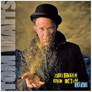
Original Glitter and Doom Cover
I chose the  http://www.reggaepostercontest.com/.  I have had a lot of trouble settling on an idea for this assignment.  This is the 3rd project I have started.  The record image in the background is not mine I would have to recreate that and i am not entirely sure I can do that with any success.  For the text I tried a few different ideas and I'm not in love with either.  the "neon" text distorts badly and I am unsure why.  The wind text I like but have to try and tone it down a bit.  I did recreate the map of Africa from a photo I took of the globe in my office using the pen tool in Ai so I guess that's at least something I can work off of, though I have to say I am feeling very blocked and plan on seeing what everyone else is up to and maybe having another look at my options.  Although I am getting tired of starting over at this point.


Saturday, February 25, 2012

Final Glitter and Doom Cover

This is the final image.  My husband is a huge Tom Waits fan and he took some great shots at his Glitter and Doom show in Dublin so I knew immediately this would be my starting point.

I cropped the image so I could add some text around the outside and began layering on the different text elements.

The Doom letters at the bottom I created by watching the tutorial that I posted in our discussion,  The flame texture was created by http://shaedsofgrey.deviantart.com/art/fire-45734782.
I used several different layer blend modes and added some clouds to enhance the smoke.

Tom Waits, Glitter & Doom

Original Glitter and Doom Cover


This what I have so far.  I have to make doom vertical and place it in the other image.

Friday, February 17, 2012

Portrait recreation

Original Glitter and Doom Cover
Image I took of my husband which I placed into Ai.
This is the vector image I created in Ai.
After pulling the vector into Ps, I used the brush tool (mostly 1-5 point lines) to add color and texture back into the image.
This is the "final" image.  Given more time I would have gone back to my original rough sketch and added more shadow to the forehead but overall I was happy with the stylized illustration that I created and I think with some refinement I could use it as an animation.  I use a mouse for all of my drawing which I find very cumbersome and I wonder if I should look for a drawing tablet instead.


Burning Newspapers

This is a photo I took of a stack of newspapers.  I pulled it into Photoshop and added this flame technique that I learned on Youtube. http://youtu.be/qr6s_gj8a-Y. It was difficult for me to replicate the same color burn effect to get the red so I used levels instead.

Saturday, January 14, 2012

Open hydrants on my street in Harlem during the heat wave of 2011
 Three men fish off the Coney Island Pier
 A girl riding the N train
My daughter exploring a transparent waterfall at the Children's Museum in NYC